A performance metric measures an organization’s behavior, activities, and performance. It should support a range of stakeholder needs from customers, shareholders to employees.
IMPROVE PERFORMANCE THROUGH AUTOMATION

The automation of reporting removes the need for tedious data collation, allowing management and staff to innovate and make key decisions that improve an organization.
A metrics management system is made up of the following components:
- Aggregate Queries
- Data Warehouse
- Dashboard or Reports
Few phenomena characterize our time more uniquely and powerfully than the rapid rise of information technologies.
What are Aggregate Queries
In database management an aggregate function is a function where the values of multiple rows are grouped together to form a single value of more significant meaning or measurement.
On metrics management project Data Analysts work closely with SMEs to understand the reporting requirements. These are then handed to the Technical Analyst who drafts summary queries that will provide the data used in the reports. These summary queries can be automated to populate a Data Warehouse, via SSIS packages.
What is a Data Warehouse
A data warehouse is a large store of data accumulated from a wide range of sources within a company and used to guide management decisions.
Dashboards and reports point to the data warehouse. This strategy removes the summary querying from the report, improving performance.
Dashboards and Reports
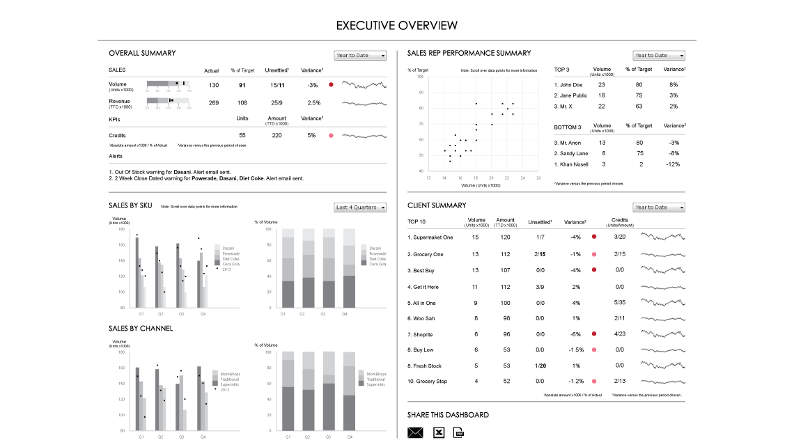
A dashboard is a visual display of the most important information needed to achieve one or more objectives; consolidated and arranged on a single screen so the information can be monitored at a glance. A Report on the other hand is any informational work. This information can be at any format. Table, Chart, text, number or anything else.
Platforms may vary widely, from browsers, mobile apps to third party software such as SAP Crystal Reports. Regardless of the technology, reports and dashboards should employ parameters that allow the user the flexibility to interrogate the data. Additionally the most comprehensive dashboards include benchmark data, which help the user understand the contexr of the metrics.
Dashboard Design and Data Visualization
Data visualization is simply the representation of information in the form of a chart, diagram, picture, etc. How this is achieved is entirely in the hands of the dashboard designer.
There is a temptation to jazz up dashboards, but this only reduces its impact and can frustrate users. A dashboard’s sole purpose is to produce answers, not to entertain. Strategic decision-makers are busy people who may suffer from optical fatigue, as such your dashboard must direct a users glance as quickly as possible to key information. The determination of what represents key info and how it is displayed are integral to the success of your dashboard project.